
Kazza K’s Book Covers Of The Year 2013

Sight is one of the five senses and one of the most complex. It is also amazing to be able to see colours, shapes the world before us in a stunning visual display. Which leads me into book covers.
Book covers form an integral part of any book. They are the first impression. A reader can have their eye caught by the right one and have a sense of great joy or a profound connection. They can just as easily be turned away by something that is unappealing. As superficial as that sounds, and it is, because there is many a great book with an ordinary book cover, it is a fact. Pretty covers grab attention. But there are plenty of poor books with great covers, and as I said before, vice versa. It’s just that you are ahead of the game, initially, if you visually grab people’s interest.
On Top Down Under Book Reviews is different to other review blogs out there in the way it presents itself. We quite deliberately chose the format and theme we use as our home page for a very good reason. Both Cindi and I are cover-lovers. We feel that we give authors a chance to show off their books here and the page is like a virtual bookshelf for readers to see all laid out. We have had many people tell us they like the way the blog presents, its visual appeal, and truth be told if you have a nice cover it really pops here.
I have never been able to draw. I am even lousy at stick figures, but I do love art and creativity. I know what I like and what is stimulating to my eye. When I read a book it is pretty much always my Kindle that gets used to do the reading (my eyes are not what they once were) but I still go back to the cover on Goodreads or if I have the paperback I look at that as inspiration. Book covers mean a whole lot to this reader.
I love coming onto the blog and looking as new books are posted. I look critically at the cover before I read the review. I take the time to scroll the home page and relook at the covers at least once a week. But what matters the most to me is that the cover artist got the brief so right. A lovely, shiny cover is nice, but what makes it better is that the cover ties in with the book it represents. My covers of the year meet that criteria, they look nice and, to me, they fit the book’ story perfectly. I have read every book on my Book Covers of the Year list. No matter how nice they look, if they don’t fit the book I have not included them.
The covers are in no order. They each fulfill my ideal. They have a way of relaying what the book is about by looking at them. To me, it’s the sum total of the story the author was telling and how it was met in the cover by the cover artist. That is my perfect criteria for the top ten covers of 2013.

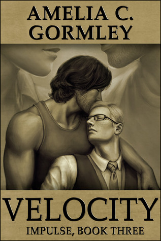
This cover IS Derek and Gavin. Derek has dark, collar length hair. He is a tradesman and he is fit. Gavin is more petite, has sandy coloured hair and wears glasses. He is white collar and more noticeably gay. Derek is more masculine, plays hockey and is more outdoorsy.
This book is the end of the trilogy and Derek and Gavin have formed a closer bond. They are awaiting the final results of Gavin’s HIV test. Derek has completely let Gavin in and Gavin has fully accepted that Derek is not like his former boyfriend. That he is a good man who will love him for who he is no matter the result.
To me, this cover represents all that is in the book. No flash, no sparkle, no glitz. It is representative of two men who have finally drawn close together. You can just feel the love coming off the cover. The men on this cover are Derek and Gavin and the mood captured is very much representative of their love. Understated elegance that says so much.
 Portrait of a Crossroads – Amber Shah
This is a hard story to get a cover right for. It is a character driven fiction of a young girl uncertain about her future, living at the literal and metaphorical crossroads of her life. Annette is eighteen and unsure where she will go and what she will do. People from her school have left her rural town in search of college and something more, as young people are wont to do.
But Annette found her father after he hung himself. She lives with her brothers who have their own lives to live. Annette is aimless and not sure whether to leave the house at the crossroad of Burford and Brantford. Sadie moves in across the street from Annette. She is an artist who paints commissioned portraits. Soon, Annette is helping her out and she has her first truly positive sexual experience with Sadie.
I love the girl on the cover, the road she is walking on, the light at the end of the road and the fields on either side. This cover really picks up the mood of the book perfectly, says so much and it is beautiful to look at.
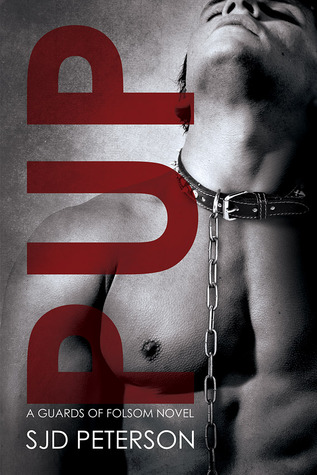
This cover could just be on any list because of the pure sexual magnetism that it radiates. I mean, whoa momma! this is one shiny, sexy cover. But the main reason it is on this list of Covers of the Year is that it is representative of the story.
The sheer need and desire of Micah to be a sub for Tackett. His frustrations at being what is required in the lifestyle, for the man he has his heart set on. Having to hold back, enjoying it when it comes his way, and he gets his man…but still he has much to learn.
There is such a passion and a yearning on the cover model’s face. The collar and lead are perfect. I really thought that this cover was Micah and his feelings laid bare for all to see. You look at it and know that this book is about BDSM. I loved the vertical use of the title. I loved that you can tell quite a bit about its content without having to look at the official blurb. A passionate and sexy cover for a passionate and sexy book made this a worthy cover of the year.
 Here, the cover captures an older man, who looks as if he would be around fifty. Around him are auras and, I guess, what you would call things that us everyday folk can’t see, but Russ can. I think it is such a clever cover and the colour is absolutely striking. Simply terrific.
 Rescued by Love – Meredith Russell, Cover Art. Kimberly Hunter, Photography
The cover on this book is 100% perfect for the story. Graham comes back from his final tour but his brother doesn’t. Graham is left to deal with the loss. More than that, he has found a letter from his brother sent before he died asking Graham to find Jake, his German Shepherd. Jake was being looked after by a lady who has since passed away. When he finds Jake he also finds Wyatt, the soon to be love of his life, who works at his family’s no kill rescue.
There is an emotional visit to Arlington for Graham and Wyatt, which involves Graham’s brother’s resting place, Jake, a teary farewell, some service dogs and other families.
This cover has everything represented in such a lovely way, you just know what you are going to get – Arlington, Jake the German Shepherd, the love of the two main characters. This cover is Rescued by Love, and that’s what this list is all about – the perfect fit.

Yep, this cover is Kate Kane, Paranormal Investigator. To. A. Tee. The Fedora hat. The attitude. The lipstick. The night time setting. Big Ben, so quintessentially London. Even the lighting in the background is a fabulous touch.
The mood of the cover, the monochromatic shades. I could not think of a more perfect cover for the first book in this series about a female PI who drinks too much, has quite a bit of snark and hangs out with the supernatural set – including shagging an eight hundred year old female Vampire Prince, Julian.
The cover says so much. It is simple yet detailed all at once. It could have been garish with vampires and mages busting forth, but instead it focuses on the mood, the setting, and the main character. To me, Kanaxa got this so right.
 Something New Under The Sun – L C Chase
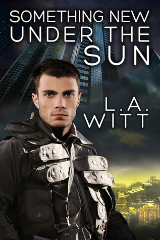
This is the second book in the series and I really loved this cover. The book is futuristic, cyberpunk, full of mods. It is also about the Sky, where the wealthy live in huge buildings, their ivory towers. It is also about the Gutter, where the air is yellowish and putrid and life isn’t worth much. The two protagonists are from both worlds but need to work as one to take down the people who are after them.
This cover has the ivory towers of the Sky above, it has the foul yellow air of the Gutter below. It also has the perfect representation of the futuristic mods and clothes down right for the writing and the POV of this book, and he is right in the middle of both worlds.
You look at this cover and know it is futuristic, sci-fi/fantasy. Once again it perfectly meets the book’s storyline. The cover isn’t busy and yet it says so much to any potential reader in a bold and dynamic way. Just what you want in a cover.

This cover is just something else, on so many levels. I knew when I saw it I had to get the book. When I read the blurb I was keen. But it was the cover that was the initial hook.
With of Without Him is about a rent boy who is hired by a rich man for a contracted period. The book is erotic. Dark. Kinky. Brooding and angst-y . The cover says it all, just look at the faces, the mouths, their proximity to one another – one right in the others face and space – the positioning of the men. What is one about to say (or what has he just said) to the other? What is the man in front thinking? The man behind? It makes the reader look and it makes the reader think and feel. It’s sexy. It’s Perfect.
 Wolf at the Door – Adrian Nicholas
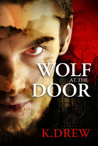
Wolf at the Door is a noir, gothic horror, romance, paranormal book. It is hard to describe in a review let alone do a memorable cover for. But the cover is definitely memorable and incredibly striking.
Every time I pass it on the home page my eyes stop and look again because something new seems to hit me. The stately manner, which plays such an integral part, there in the background looking suitably menacing. The malevolence and grim nature of one of the primary characters – Sebastian – is there, but it could quite as easily be representative of the change to Nicholas Ashbee.
There is a dark foreboding to the whole book and it is right there on this cover. It picks up on the mood of the book perfectly. It is always so visually appealing every time I see it.
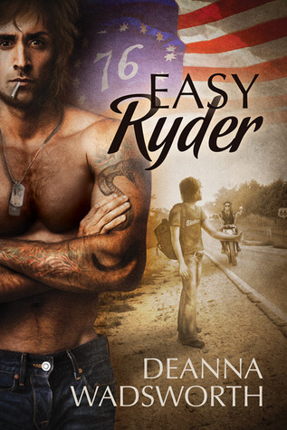
This cover nailed the two main characters of Easy Ryder – Michael Ryder and Snake. Michael, the young idealistic teen who decided to leave home in search of a kinder more accepting place in the world. And Snake, the Harley riding ex Vietnam vet who facilitates the cross-country lift that Michael needs.
It is the Bicentennial Independence day weekend, 1976. It is all on the cover – the flag, the year, the characters, the Harley, the pick up. Just perfect.
If you wanted to know a bit about the book, the cover is showing its wares loud and proud for the story of Easy Ryder. If I loved this cover when I first saw it, and I did, then I really appreciated it by the time I finished the book. Just fabulous.
Search Our Site
Weekly Deals

Books of the Month


BLOG EVENT

Featured Books


Coming Soon


What a great list. Each one stands out in such an appealing way. Covers mean so much more when they actually represent the words inside. I can easily see why you chose these as your favorites of 2013.
Thanks, Cindi. You know how darn hard it is to pick only 10 book covers – look at our home page…GAH!!
I thought these were all matched up: cover and contents:)
What compelling covers! I can see why they caught your eye! There is a wealth of depth and range here too. 🙂
Thanks, Sarah 😀 There are some amazing cover artists out there and some great collaboration between writer and cover artist it appears. I could have easily added a few more.
Nice covers. Great choices, Kazza
Thanks, John 😀